

Tech Tree Updates and Similar Projects
With credit to other tech macrohistory enthusiasts


The historical tech tree I announced a few months ago got a pretty good reception! The announcement tweet went viral, the Asterisk article was apparently relatively liked on Hacker News (I don’t dare take a look, I can’t stand the pedantry), and the tree was shared on a big Spanish tech blog, a big German tech blog, and Erik Hoel’s substack. It currently shows up in ninth place when I search for “tech tree” on Google, ChatGPT agrees that “if you're looking for the best online historical technology tree, the most comprehensive and visually compelling option right now is the Historical Tech Tree by Étienne Fortier‑Dubois,” and my analytics tell me that more than 50,000 people have visited the website. This is way more than I expected!
Since the launch, I have kept working on the tree, but at a slower pace than before. I added many new techs (most recently: techs related to whaling) and some display options. The next big feature I’ll try to add is zoom.
But more importantly, I’ve been thinking about the future of the project. What can I do to make the tech tree more than a curiosity in a corner of the web?
One answer is community-building. To this end, I created a Discord server which you can join now! This is big, because I had to get over my Discord aversion to create this! But so far not much has happened on the server and I don’t really know how to make a Discord server fun, so I’m kind of counting on tech tree fans to go there and make it lively. So please don’t hesitate to comment in it.
Another answer is allowing others to build on it. To this effect, I have open sourced the code publicly on GitHub under an MIT license. It is therefore possible to contribute to the tech tree app by submitting e.g. bugfixes, or use it as a base to spin up your own timeline with connections project. Just be sure to credit the original!1
I’ll also most likely be writing about the history of technology a great deal. I’m part of the 2025 Blog-Building Intensive Fellowship of the Roots of Progress Institute, which is super exciting and starts today, and while I don’t quite know yet what I’ll focus on in the essays I’ll write as part of the program, the tech tree will almost certainly feature in it. So, stay tuned (and sign up to this Substack if you haven’t already!).

This post is also an opportunity to credit other tech macrohistory projects that I’ve come across in my research, other than the Civilization game tech trees. Here are five of the most interesting ones.
1. James Burke’s Connections and K-Web (1970s-today)
Search anywhere about tech trees and, sooner or later, somebody will mention James Burke’s TV show Connections. There is also a book (which I have read most of) and… a web app! It’s called the Knowledge Web, and is available at k-web.org.
… Or should be, anyway. I spent at least an hour on that website fruitlessly trying to find a link to said app, and concluded that it never saw the light of day (or public release, anyway). I even wrote that in my Asterisk article. Later, someone suggested that I reach out to the Facebook fan page for the Knowledge Web, and that worked! The app, I was told, is available at https://bra.in/8qadMm. It looks like this:
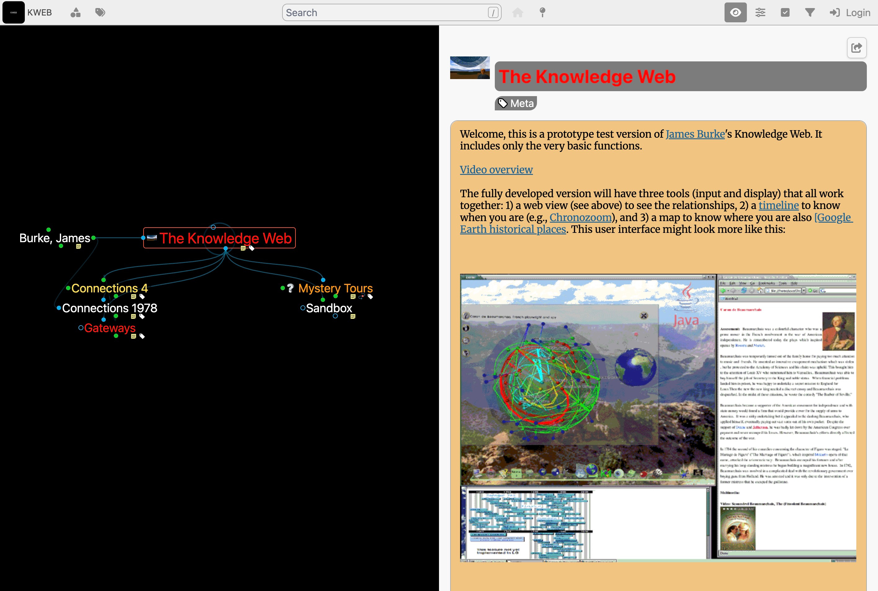
What’s cool about it: As the name Connections implies, James Burke really focuses on the connections, unlike most representations of tech history, which just put things on dates without linking them together. The storytelling is good; I didn’t know about it, but apparently in Britain Connections is a classic.
What’s lacking: It’s really hard to watch a TV show from the 1970s, even if it’s on YouTube! Fortunately the book makes it easier, although it focuses a bit too much on European history, which means that sometimes there are interesting connections that I can’t use because there’s an earlier invention in China or something. Some parts of the book are also outdated; for example, one of the coolest chapters is about the connection between the invention of the stirrup and European feudalism, but this is now known as the Great Stirrup Controversy. As for the app, it is very incomplete, difficult to use, not that great looking, and as we saw, borderline impossible to find.
2. Rohit Krishnan’s “Innovation” (2023)
Not long after I first started compiling my list of inventions in 2023, Substack mutual Rohit Krishnan, who writes the excellent Strange Loop Cannon, wrote a blog post called “Innovation”. It’s based on a spreadsheet compiled by Rohit, “DNA of innovation,” with 1,678 technological or scientific developments and some data (fields, years) that allowed him to create nice charts to analyze tech history.

What’s cool about it: Really interesting analysis, and the spreadsheet is a good source of data for my own project!
What’s lacking: I don’t fully understand the way Rohit represented lineages. Also, if you want to quantitatively analyze the history of technology, you had better be certain that your data collection was at least somewhat systematic. I’m not sure I trust the list enough to uncritically accept the charts. As Rohit writes, figuring out the level of precision for entries is “more art than science,” and it’s unclear what sources he used and whether they’re a representative sample of all technological history.2 Such limitations are why I have so far refrained from doing quantitative analysis on the tech tree myself.3
3. Kate Crawford and Vladan Joler’s Calculating Empires (2023)
2023 was apparently a big year in tech macrohistory, since it is also when the absolutely mind-boggling Calculating Empires: A Genealogy of Technology and Power Since 1500 project was released. It’s a very wide visualization of inventions from 1500 to 2025, beautifully organized by theme, with the goal of “exploring how technical and social structures co-evolved over five centuries. It traces technological patterns of colonialism, militarization, automation, and enclosure since 1500 to show how these forces still subjugate and how they might be unwound.”
It has been shown several times as a large physical exhibit (“The minimum size of the work is 24 meters in length, and 3 meters in height”), and is currently on display at the Venice Architecture Biennale, where it won an award. Impressive stuff. When I first learned about this I almost gave up on my tech tree.
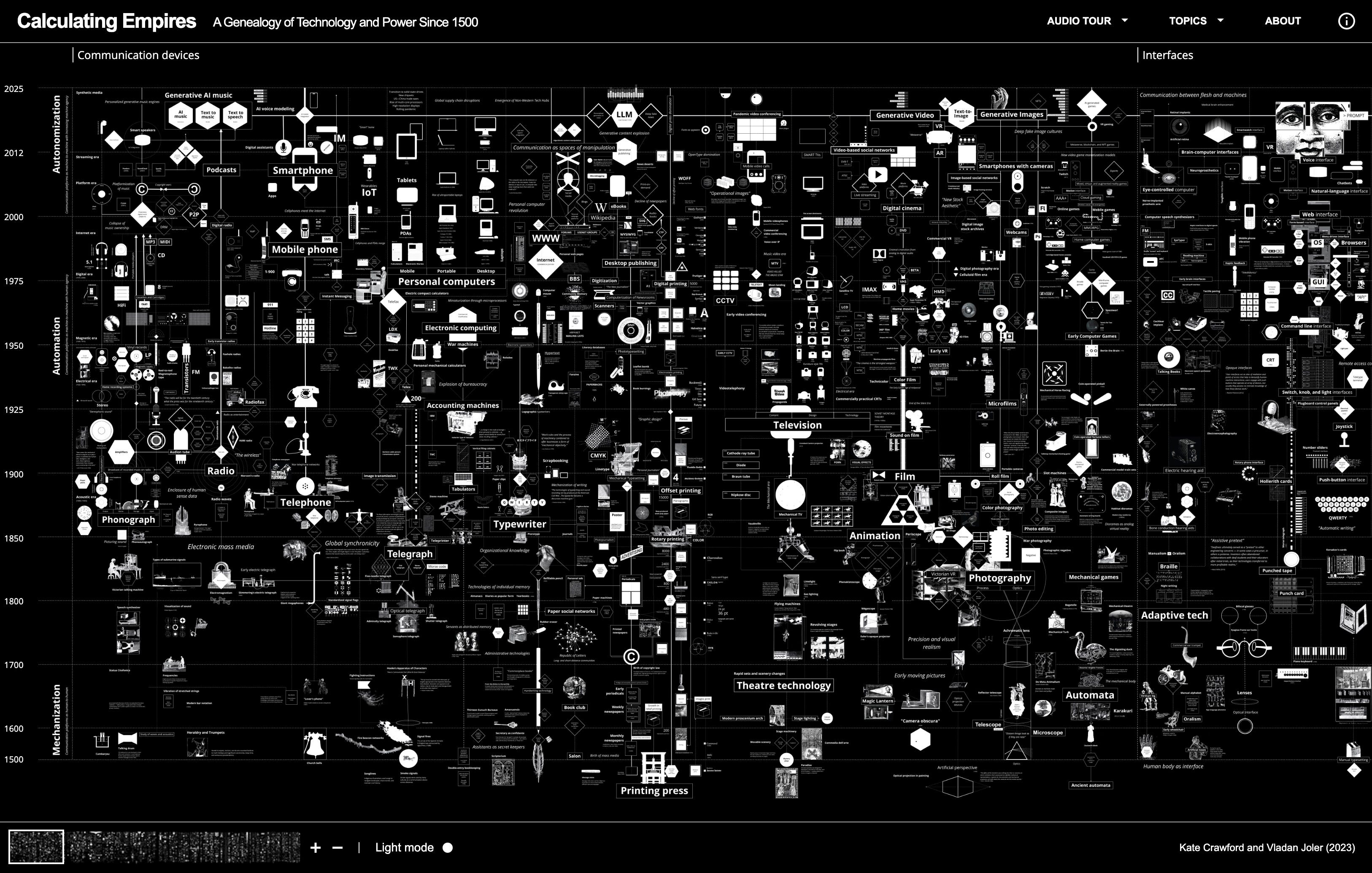
What’s cool about it: Beautiful, artistic, probably makes for a really striking exhibit at the Venice Biennale.
What’s lacking: Some kind of optimistic message? I don’t like how both the color pattern and the accompanying text are so dark. As if the only thing all that technology over 525 years bought us is more surveillance. Sure, there are harmful patterns and sinister uses of technology, but I become annoyed when people focus solely on that at the exclusion of viewing technology as solutions to problems. Also, Calculating Empires turns out to be difficult to navigate. The connections between the techs aren’t explicit, so you just wander around without really getting anywhere other than to a general vibe of “technology is bad.” Which is why I didn’t give up on my own project after all.
4. Our World in Data’s “Technology over the long run” (2023)
This is somehow also 2023, the year where tech macrohistory started being a thing apparently. It’s just a timeline and a brief accompanying article, but it takes the passage of time seriously enough to be worth looking at:
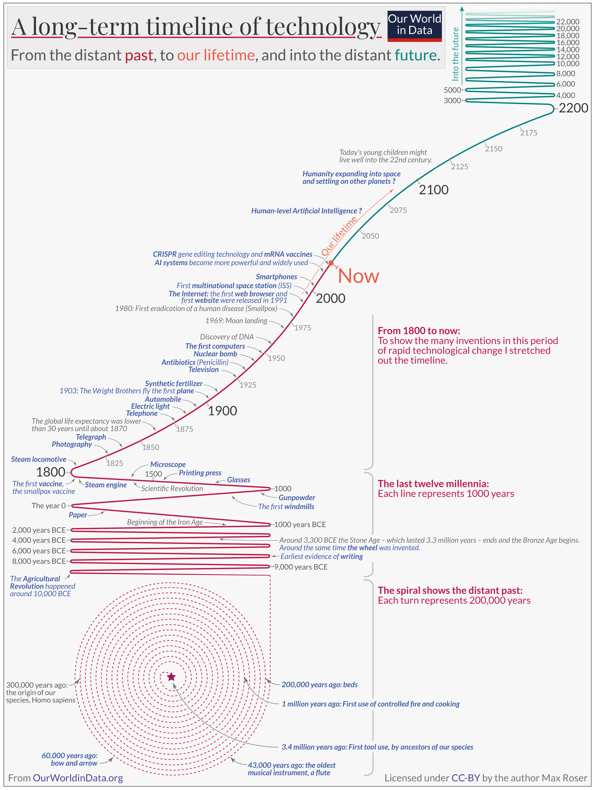
What’s cool about it: A good visualization of the fullness of time and how things have accelerated
What’s lacking: More data than just a few key inventions.
5. TomiTapio’s Timeline of Mankind (ongoing)
Finnish Twitter user @Tomi_Tapio has been compiling this list since 2021. It’s a massive spreadsheet with currently (as of downloading it from the pinned tweet) comprises 42,276 rows. For context, my tech tree has 1,940 inventions right now. The Timeline of Mankind contains much more than just inventions, but you can filter the list to get only those.
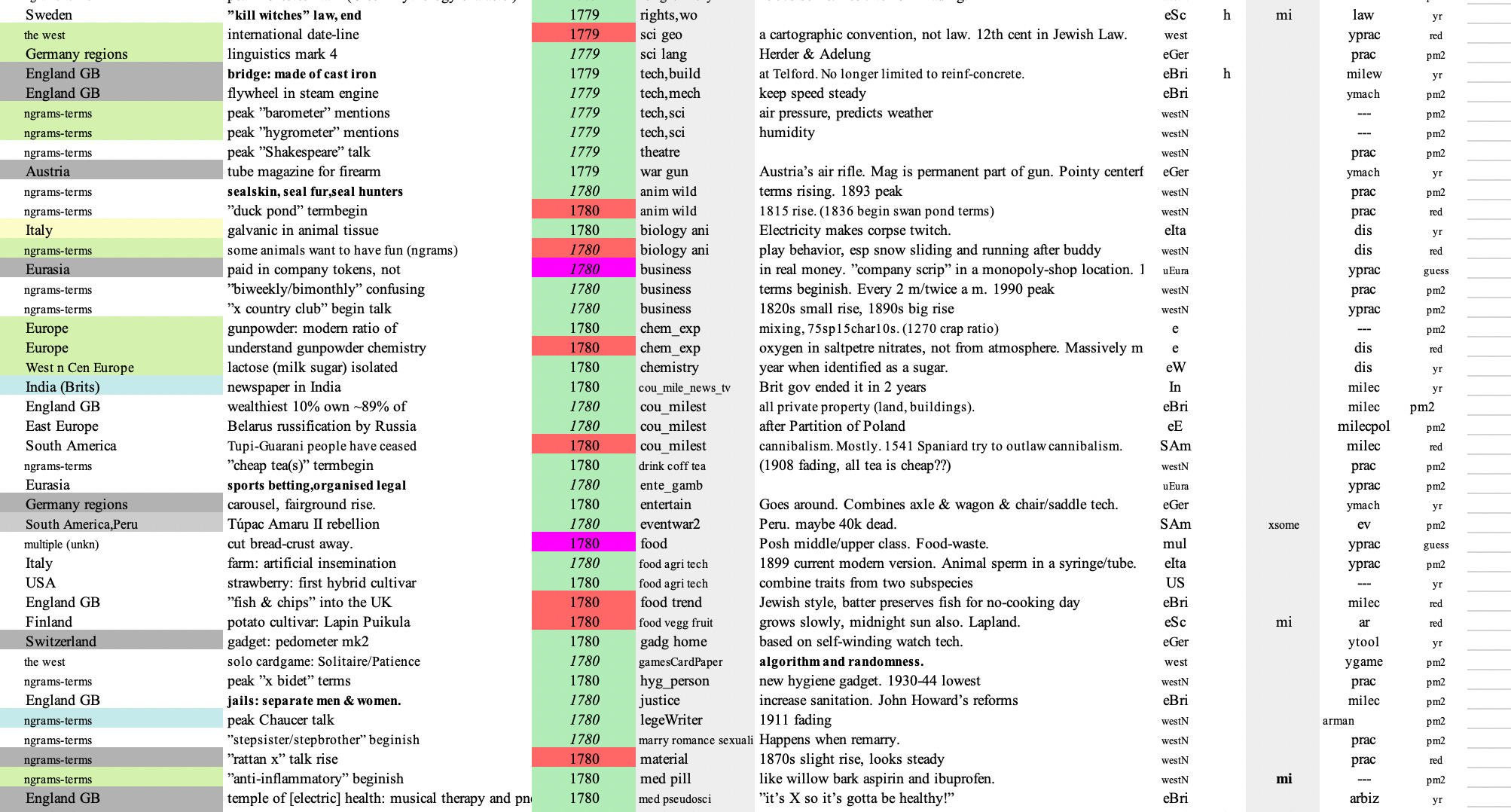
What’s cool about it: It’s just so much work, wow. TomiTapio told me that he puts in at least 1.5 hours on it per day. He wishes other people would help.
What’s lacking: It’s difficult to read or learn clear things from it! I think someone should help vibe code some visualization tools for it!

There are of course other projects of the sort4 — but these are the ones that stood out to me the most. Also, what’s up with the fact that all of them are super recent? Did nobody other than James Burke ever bother to make tech history visualizations before the 2020s? Maybe I need to put this entire genre of thing in the tech tree as a recent technological development. I wonder what the precursors would be.
I haven’t yet released the data (the list of technologies and connections), so that remains under my control for now, partly for quality control reasons and partly because it’s where I put in the most work. But do talk to me if you’d like access to it.
He definitely used Wikipedia’s Timeline of historic inventions, since I recognize the pattern from that list, having used it myself. But there are other sources.
It’s definitely tempting to notice quantitative patterns. For instance, there seem to be fewer inventions after 1970 in my tree. Is that a sign of the Great Stagnation? Or an artifact because we tend to recognize and define recent inventions differently from older ones?
One that I hesitated to mention and therefore relegate to a footnote is Charles Murray, the libertarian political scientist which controversial views on race and IQ. He wrote a book about human accomplishment in 2003 and released the underlying dataset in 2022. I looked at some its 7,331 entries and got ideas for my tree, but Murray’s data doesn’t cite any sources and I frankly don’t understand where he got several of the dates, so I don’t really trust it. Which is convenient because it allows me to ignore him and his controversial opinions.
Also, perhaps slightly different, but Brian Potter over at Construction Physics has been running a cool 'US Megaprojects' database https://www.construction-physics.com/p/contribute-to-the-us-megaprojects?triedRedirect=true
https://docs.google.com/spreadsheets/d/1eLJ2vecazRRGVeldxD-adUWt2Wc73T1BqH2fcsFHYDo/edit?gid=1912799216#gid=1912799216
These are very neat!
Another list of interesting innovations (focusing especially on technological discontinuities) was developed by some people at AI Impacts -- e.g. https://aiimpacts.org/discontinuous-progress-in-history-an-update/. or https://aiimpacts.org/observed-patterns-around-major-technological-advancements/
Another overview (more an essay series than a database) of past technologies was also composed by Low Tech Magazine at https://solar.lowtechmagazine.com/obsolete-technology/
I've gone through these as part of a currently ongoing project, to index historical cases of 'paths untaken' -- unusually delayed, mid-development abandoned, or relinquished/dismantled technologies -- and the factors that plausibly contributed to this. I'm still working out and cleaning up the database (around 320 cases), but you can find some early selection of cases in this essay ( https://verfassungsblog.de/paths-untaken/ ) or this 2023 talk I did ( https://drive.google.com/file/d/1VxN3FDV-sZcCUe5LyxjInG2NAewiGIsj/view?usp=drive_link - see slides #43-57; and bibliography on slides #70-75).