


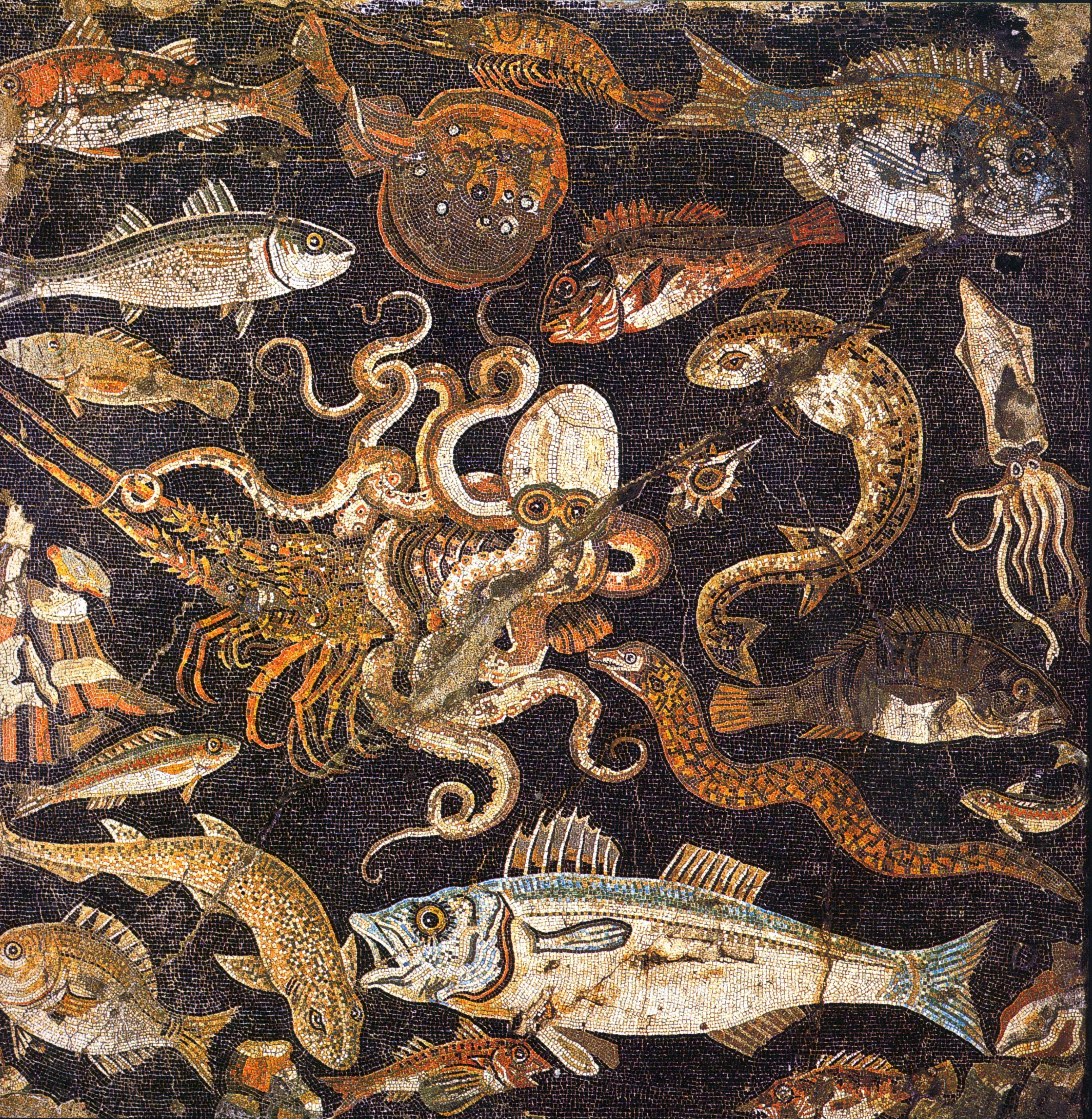
I don’t really need a personal website, but a few years ago I made one, because why not. It was rather plain. A simple WordPress website, with a picture of me and a list of things I’ve been involved with, both out of date by now. I had been meaning to make a better version for a while, but I didn’t know how, or what.
Then, not too long ago, I happened upon the personal website of Felix Rieseberg, an Anthropic employee who works on Claude. Rieseberg recently used Claude to redesign his personal website, to very, very impressive results.
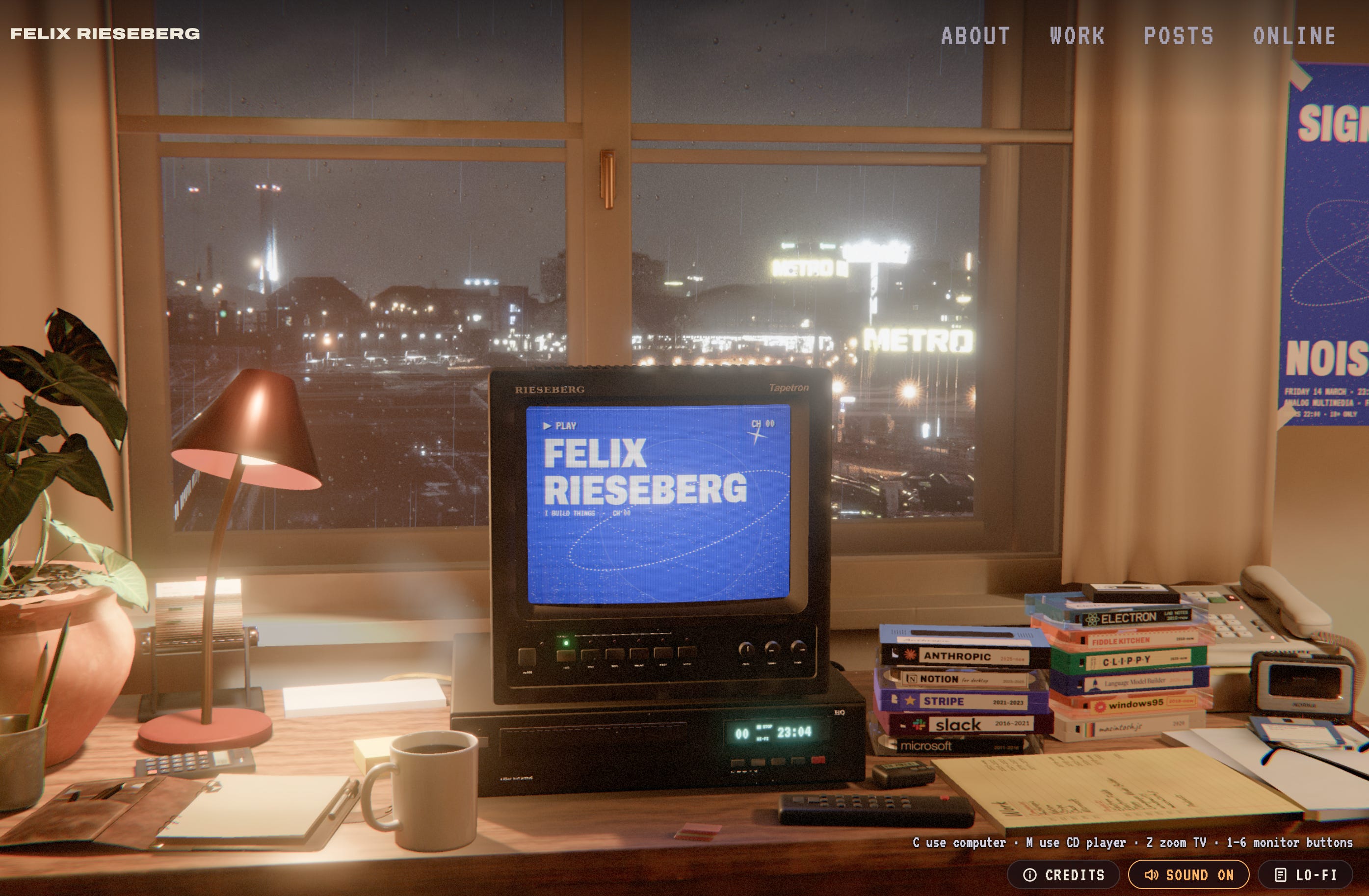
His website is basically a mini-game, fully rendered in animated 3D. It is set in a rainy Berlin night, has a theme of vintage VHS tapes, and features a parody documentary about a nihilistic penguin that tells us about Rieseberg’s work and life. It’s not the most usable thing in terms of displaying information, but it looks absolutely incredible (and you can switch to a “lo-fi” version if you like).
In the more normal sections of the website, he also has a blog post, Made by Mechanical Means, in which he wrote about the process to get this done. He used Claude Opus 5.5 for the entire thing. He gave it relatively little direction at first, just dumping images and concepts he liked as inspiration, and had subagents of Claude work on designing prototypes. He eventually chose a theme that Claude suggested, the vintage VHS, and gave it more creative direction (“an interactive version of the kind of room a 90s German movie would give a journalist”). Claude produced a second draft that already looked a lot like the final version. Then there were about 60 more iterations to get to the final result, but that was mostly detail: 3D textures, music, the fake documentary, the view outside the window using a depth map, and so on. Rieseberg never read any of the code.
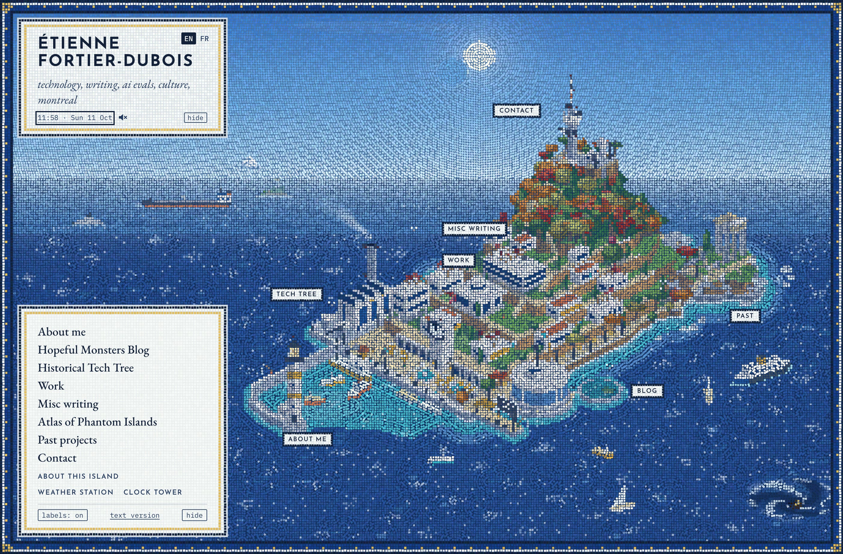
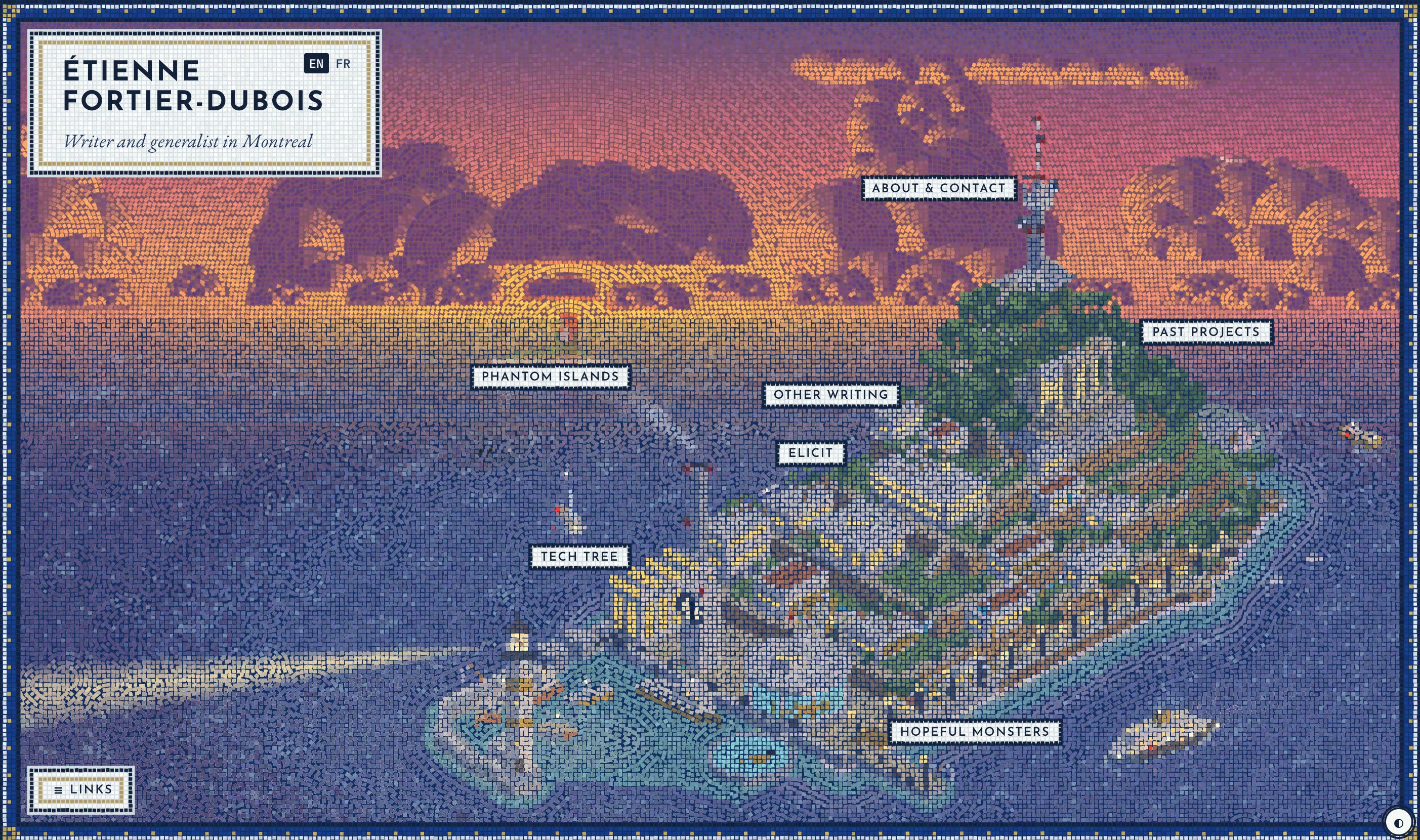
I decided I wanted my own version. I started on October 11, followed a similar process, and released the new website at etiennefd.com nine days later, on October 20. I am very happy about it. It looks like this:
The rest of this essay is my version of Rieseberg’s post, detailing some of the process, with concluding thoughts on what this all means.

Like Rieseberg, I started from very little. This was my first request:
I want to redesign my personal website, etiennefd.com. I’m inspired by https://felixrieseberg.com/made-by-mechanical-means/ which describes someone’s process with Claude Code and also these websites I like: [links]
I can give you images of aesthetics I like, personal projects to show my personality and interests (and also feed content for the website), etc. etc.
I’m doing this with my boyfriend and we’ll want to design his website too, but let’s start with mine. I think I want to explore different design directions. We attempted something called “grammar of pixel ornament” a little while ago but I’m less excited about this now.
What’s the plan
It gave some ideas based on the handful of websites I gave it, and then I dumped the contents of a few folders of particularly aesthetic images I’d saved over the years.
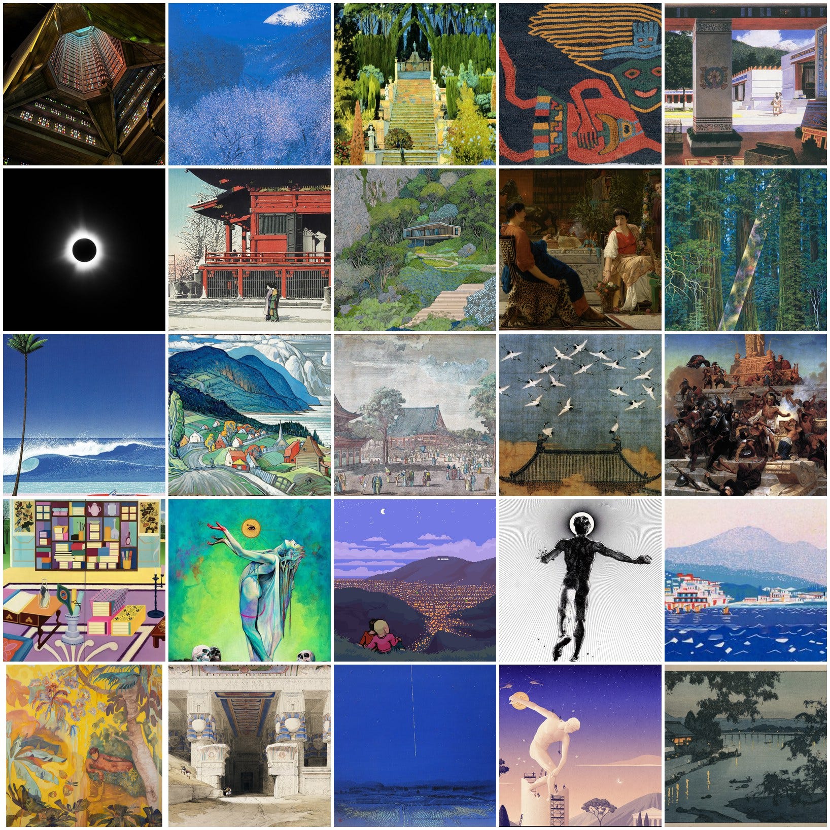
I also told it to read my entire blog, about 240 posts, and consider the posts’ cover images, which it did by creating six parallel reader agents. It then produced 16 ideas. I gave it a quick list of things I wanted to include (URLs to my blog, tech tree, misc writing projects, etc.) and 16 agents got to work.
The results were already extremely impressive:
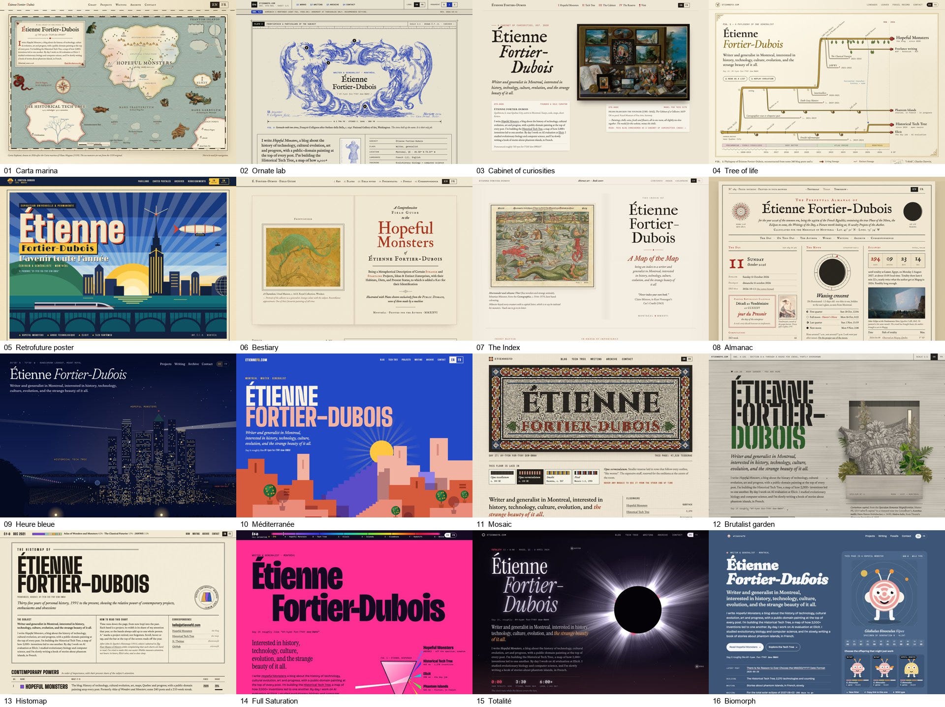
The six blog readers had sized me up pretty well. They found my appreciation for maps, ornamentation, timelines, retrofuturism, evolutionary biology, color, brutalism, mosaic, the blue hour, and astronomy. But I wasn’t quite satisfied with any of these designs. They were all too busy, too organized like a classic website with a hero section followed by other sections once you scroll down, and most of them were too beige.
So for round two I offered my own creative direction. I picked some favorites from above, and said:
one thing I realize is that I want the main page to have much less content. Like ideally you wouldn’t even need to scroll. Random thought I had is a small city/landscape/island i[n] isometric view with various locations on it that are links to projects / pages / etc.
or a mini-game like the biomorph thing
The main goal is more to show that I’m a cool person with taste rather than serve as a directory of my stuff (though that is a secondary goal)
It got to work on five more prototypes, three of which followed the idea of an island in isometric view with a sea monster roaming.
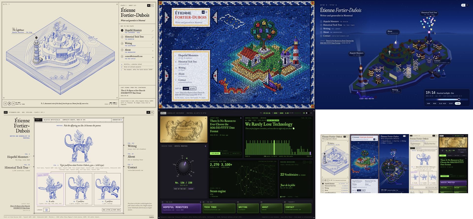
My boyfriend and I looked at this and immediately picked the second one: the island drawn in mosaic style, with glittering water. The main creative direction had been set.
Like Rieseberg, I ended up with about 60 iterations, counting the above 21. Iterations 22 to 24 were about finding the correct style for the island. We explored the idea of an Italian villa and garden on a lake island, an island that might appear in the Odyssey, and another inspired by “More’s crescent island of 1516, rebuilt as an optimistic industrial utopia after New Lanark, Saltaire and the Familistère.” This is also when I had the idea of always showing a random sea monster somewhere in the sea, linking to a random blog post at Hopeful Monsters.
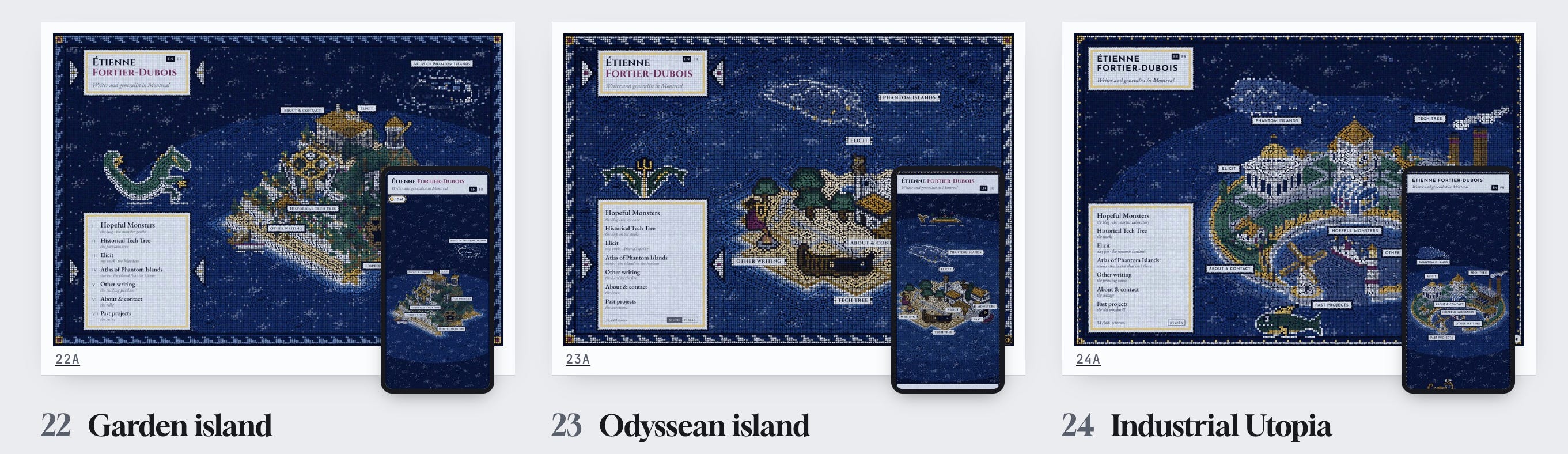
The Industrial Utopia was the most promising, but I decided I wanted something more modern (I’m in a modernist architecture phase now, older ornamented architecture is meh to me lol) and brighter. I also wanted the island to be a hill or promontory, and the monsters to come from my pixel art versions on the blog. We explored a few more island and architecture designs, and by iteration 29 we had the basic layout.
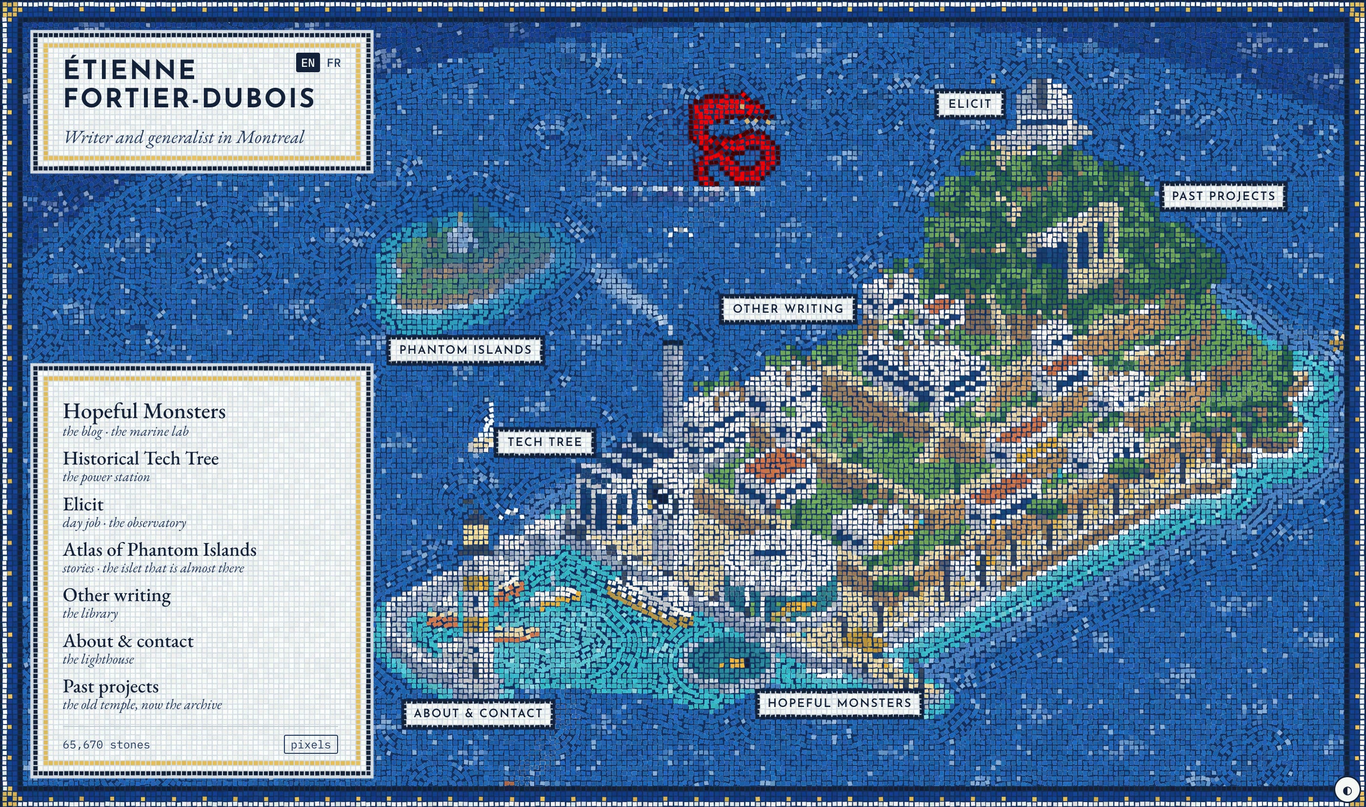
The last major change was my request to add the sky, a realistic clock, and weather.
After this, the next 20 versions were mostly polishing, fixing bugs, and adding small fun details. Lots of small fun details. The island is full of Easter eggs, mostly thematic links to blog articles at specific times. Many, I assume, will never be seen by anyone, but no matter: adding them is fun enough. For example, the movement of the sun and moon is realistic, based on the location of Montreal, which means that if you change the time (by using the clock tower) to April 8th, 2024 in the afternoon, you can see this:
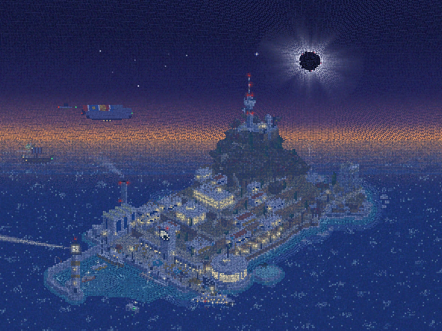
And if you click on the solar eclipse, you get to my article about it. There are many other little things like this.
I found it interesting that much of the creative direction ultimately came from me: the concept of the island, the sky, the sea monsters, the architecture, the layout. Even mosaic was basically what I already had in mind — a previous attempt at website-making, a year or two ago when vibecoding was much less powerful, was entirely based on making a mosaic-laying engine. Many of the small details were my own requests, like the blinking red aircraft lights on the tall buildings.
But Claude had some good ideas too. One of them was the stars. While the sun, moon, and occasionally visible planets are roughly realistic, the night sky is a whimsical starry vault. This came from Claude early on and I never changed it.
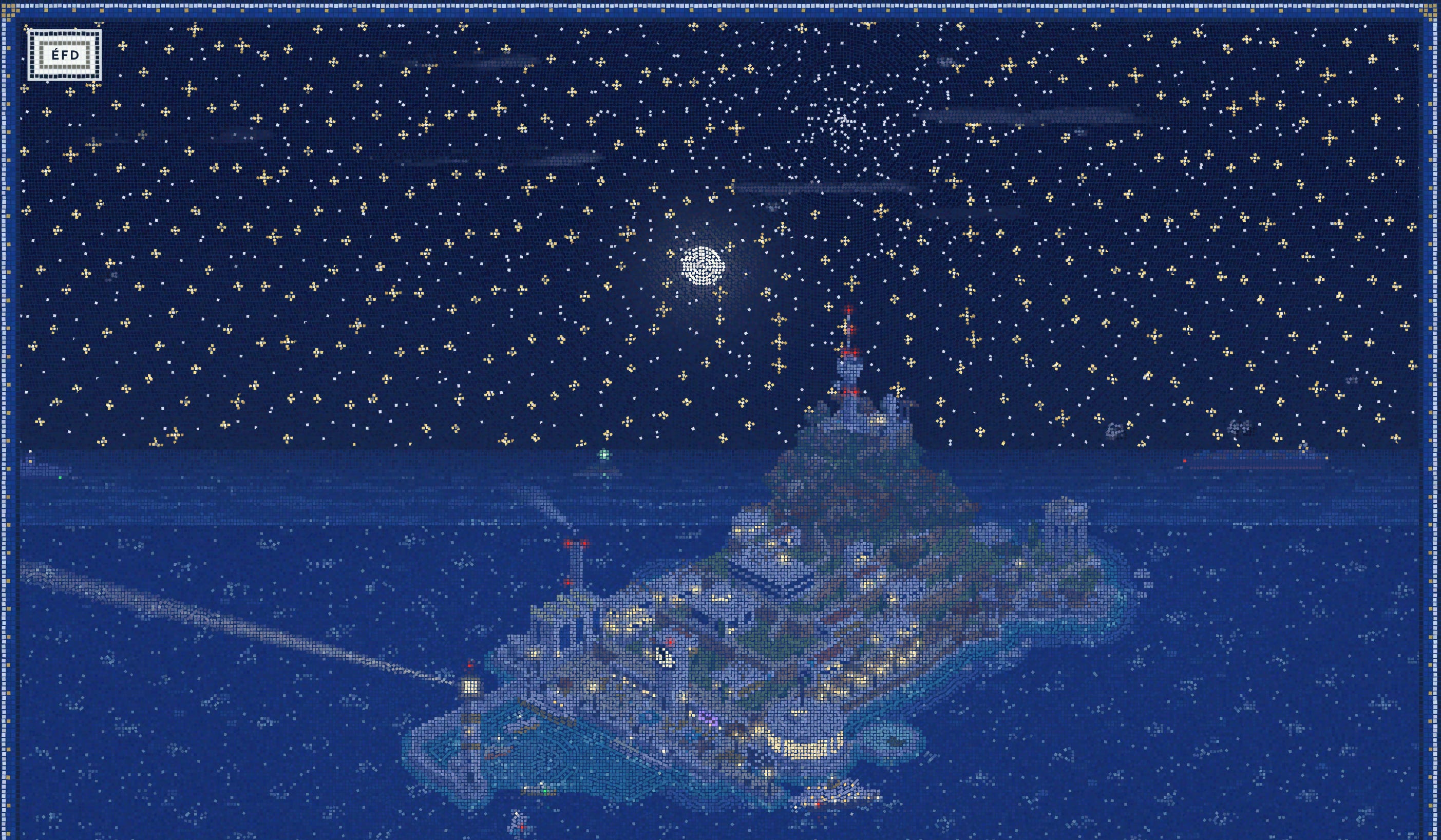
It reminds me of this (now deleted) tweet, which I quoted in April 2025:

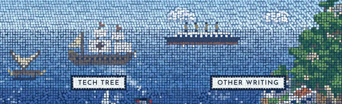
Another of Claude’s interesting creative choices was when I asked it directly for ideas of things to add, and it suggested passing ships from different historical periods, each linking to a random invention from the Historical Tech Tree. I said yes, and after some iterations we can now see container ships, galleons, triremes, zeppelins, airplanes, and other craft passing in the background over time.
Toward the end, I rewrote all the text — Claude still cannot write, nor do I want it to — and added seasons and even more Easter eggs. We are now at version 59. All versions are archived at these two pages, if you want to take a deeper look: Gallery 1, Gallery 2.

The title of this post paraphrases a New Yorker cartoon:
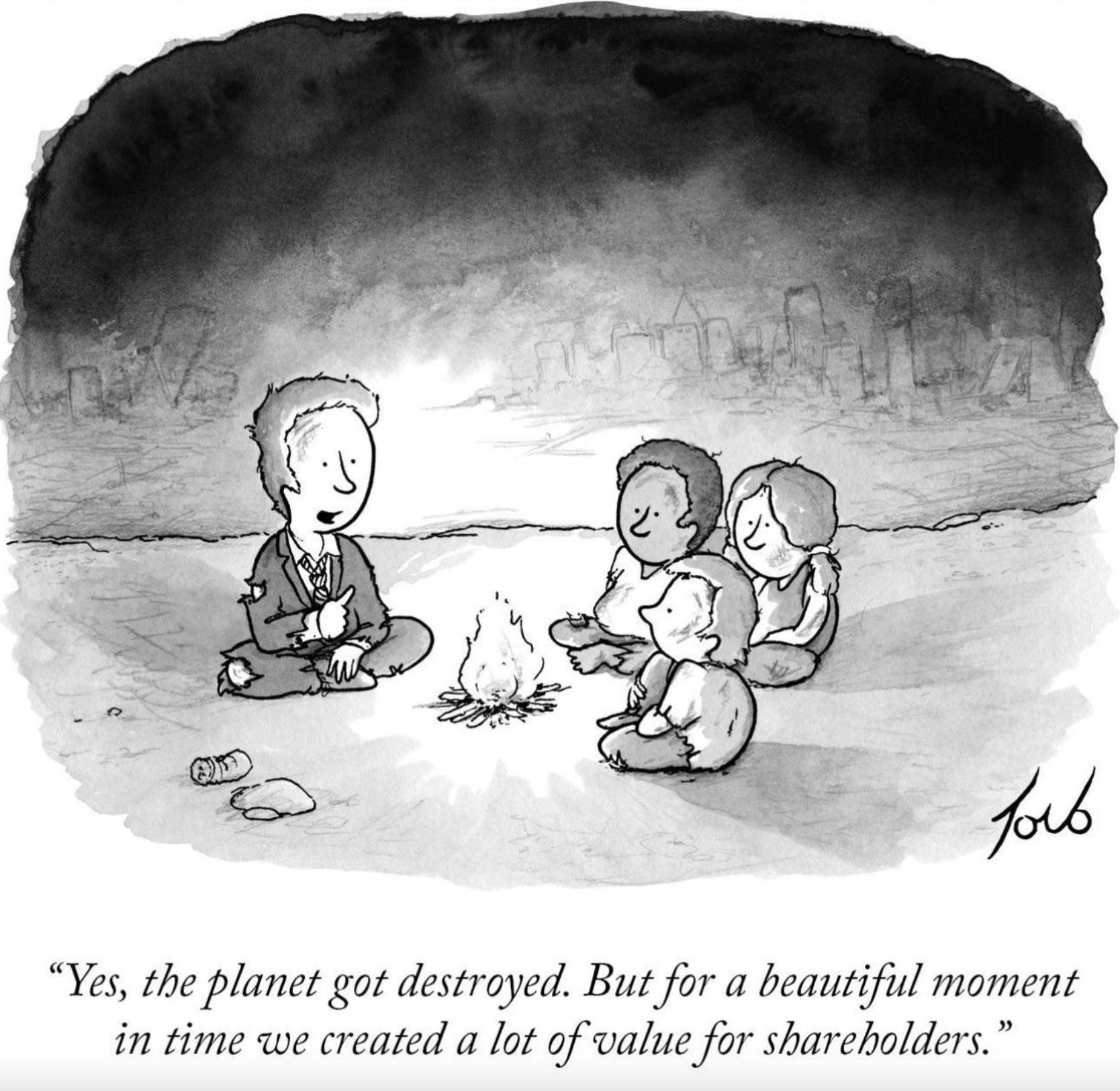
I assume the cartoon was about climate change, but AI is the more hip doom scenario now. I’m more optimistic than I have been in the past, but occasionally I enter a strange mood, and I had some of that during the making of my website. Will AI destroy the planet? Probably not, but maybe, I guess. Maybe we should pause somehow, and just enjoy Opus 5.5 for a few years. It is certainly good enough to disrupt a lot of stuff. During the project, I showed Claude’s outputs to my boyfriend, who’s a product designer, and he was both impressed and shaken at every iteration. His feelings were ambivalent: optimistic at all the new possibilities, but scared as to what it means for his profession.
But in the end, my main takeaway is that making this website was incredibly fun. And the result is amazing. I didn’t know what I wanted, exactly, but I wanted something whimsical and playful like this, and now I have it. I don’t even think it would have been feasible at all without a powerful LLM to drive it. Theoretically possible, sure, assuming unlimited time and resources. But not realistically, for me, or nearly anyone else.
I assume more and more people will take advantage of this power, and we’ll see an explosion of creative websites and other media. The amazement will perhaps fade away to some extent. Some anti-AI people will be unhappy about it. But overall, we are now living in a new golden age of personal expression, and that’s pretty great.
On Rieseberg’s website, the fake documentary says that the goal of his work is to make people enjoy their computers. I don’t know if that eventually leads to chaos and destruction. But in the meantime, mission absolutely accomplished.
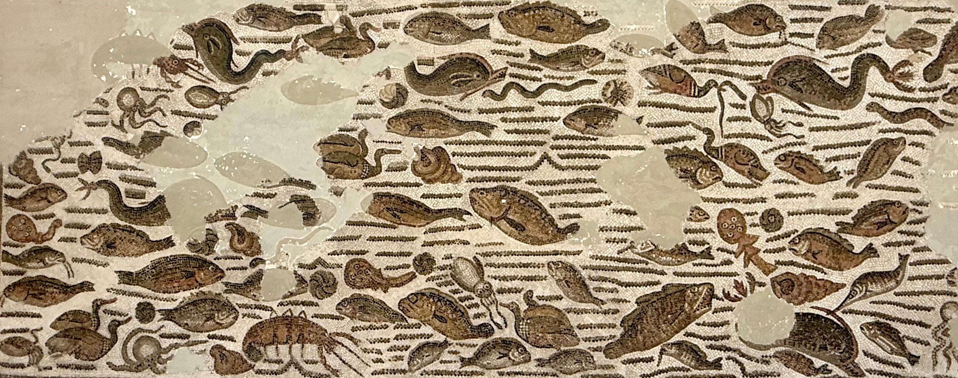
this is awesome